Would you be interested in learning more about how to visually represent your requirements, even if you have little to no technology skills? Have you been seeing the terms “wireframe”, “mock-up”, and “prototype” in BA jobs and wonder what they mean?
In this article, we’ll discuss what these terms mean, as well as provide some examples that you can use to match up your own career experience.
But first, a story.
My husband and I have taken to watching a lot of Jimmy Fallon lately. (We love to laugh and Jimmy is great, especially when replayed on the DVR at 8:30 pm. :-)) In one show, Jimmy had someone on his show with a plastic 3-D printer. These have been around for years, but now they are affordable outside of big scale R&D organizations.
That’s a fairly interesting development, don’t you think?
For a few thousand dollars and some extra garage space, I could print out plastic prototypes of physical objects. If I was designing a physical product, I could actually hold that product in my hands before investing in producing the real thing.
Have you ever held a pen that didn’t feel right in your hand while scribbling down meeting notes?
Did you wish someone had let someone like you try the pen before they produced it?
With prototyping, this becomes an economically viable expectation.
And prototyping is a relevant technique when creating IT systems too. Except it’s not about printing plastic. But it’s still called a prototype. Well, sometimes. Other people call it user interface mock-ups. You’ll also see them called wireframes.
Each of these terms has their own formal and closer-to-“right” definitions and we’ll get to those below. But the reality is that the terms can almost be used interchangeably. What’s more, depending on who you are talking to they can mean very different things (or the same exact things). This means that when any one of these terms are used in a job posting, it’s best to clarify what exactly is meant. (And especially to do so before saying, “I’m not qualified to do that!” because you may very, very well be qualified.)
The General Definition of Wireframe, Mock-Up, or User Interface Prototype
Let’s look at the collection of activities that might be considered relevant to anyone using prototype, wireframe, mock-ups, visual renderings, or any other variation on these terms.
In short, any of these visual renderings is a representation of a graphical user interface (GUI), or any interface that allows a user to interact with a device using images and clicks rather text commands.
- This web page and any other you might browse is a GUI and so are the apps you download to your iPhone.
- The TV programming screen where we select the recorded Jimmy Fallon episode with the highest potential to make us laugh is a GUI.
- If your organization has a proprietary software system, whether it’s web based or deployed on employees’ desktops, it probably has a GUI.
As a quick aside, I once worked for a company that called their internal system simply the “GUI”. As they replaced a phone based information management system, their consultants told them they were building a GUI and the application never got a more specific name. GUIs are everywhere. But I digress.
Let’s get back to the visual representation of the GUI, because that’s the part you might work on as a business analyst. The representation can include one or more screens or pages, show the navigational elements on each page, and sometimes show the navigation between pages.
We cover this in more detail in The Business Analyst Blueprint® certification program, where you can earn your Applied Certification in Business Analysis.
What a Mock-Up or Wireframe Typically Looks Like
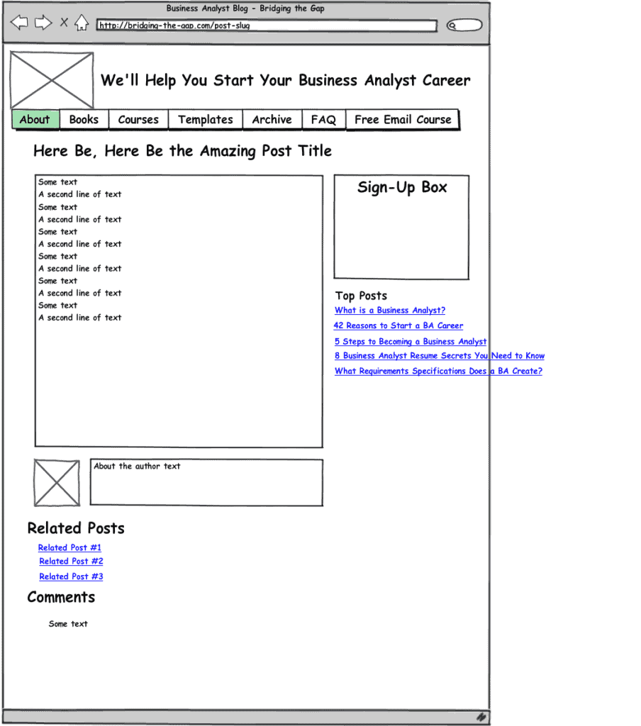
For example, here’s a visual rendering I created for Bridging the Gap.
(This type of rendering is closest to what would typically be called a mock-up or wireframe, because it’s low fidelity, and I would typically create one to accompany a use case. It was created with a tool called Balsamiq which is available for less than $100. The tool is much more powerful than what you see here. If I had invested more time, I could have made this look a heck of a lot better. But I tend to take shortcuts when wireframing so that I don’t get bogged down in the process.)
What a Higher Fidelity Visual Rendering, or Prototype, Looks Like
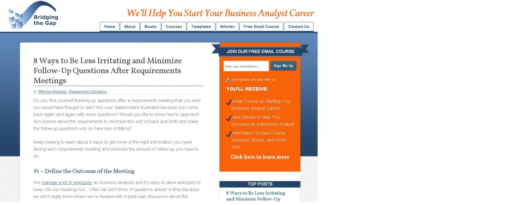
And here’s an example of what a designer created to turn this conceptual rendering into a higher fidelity visual rendering.
Starting to look a bit more beautiful, eh?
(This type of visual model is close to what would typically be called a rendering, because it is showing the exact intended look or what’s called high fidelity. And because my designer chose to create this rendering in a web framework, it is actually more like what would most commonly be called a prototype, because I could click around and get the experience of the new website, just like I could hold a plastic pen in my hand and pretend to write.)
Let’s talk a little bit more about prototypes, shall we?
In general, like the WordPress prototype my designer created for Bridging the Gap, a prototype is functional in nature. And that means your user can actually click things and have something reasonable pop up as a result, which helps them provide a great amount of feedback in the elicitation process. (I’m expecting that any day now my designer will stop being so gracious about my feedback and adjustments!)
Without any coding knowledge, I’ve created similar, albeit less visually pleasing prototypes (again, I love those shortcuts), using a tool called Axure.
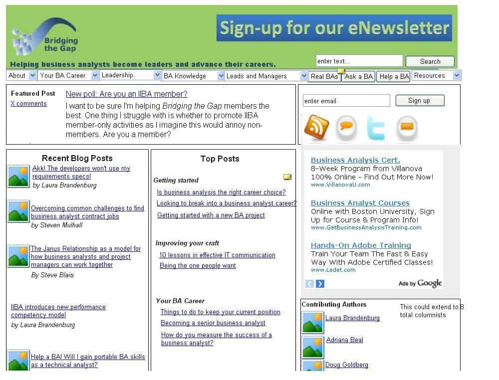
Here’s an example of a a pretty ugly prototype that ended up being the a really, really old home page here at Bridging the Gap. (This is a screen shot from a click-through prototype created in Axure – those yellow icons indicate clickable buttons.)
Have You Created Wireframes, Mock-Ups, or Prototypes?
If you’ve ever created anything along the lines of what you see above – or significantly less beautiful (such as a hand-drawing or whiteboard drawing) or significantly more beautiful (such as a rendering created in Photoshop) or significantly more functional (such as working code that was intended for a demonstration), you have relevant experience in this area of business analysis.
At the end of the day, it’s not about the technology you used. What “counts” as relevant experience is the putting something visual and tentative in front of people who will actually use the finished product and getting their feedback.
Essentially, you allow your users to hold a plastic pen. Now I’m going to head back to watching the next promising Jimmy Fallon episode.
How to Learn More About Wireframes (and so much more…)
If you are looking to gain more confidence in wireframes, along with the other foundational skill sets that are key to success as a business analyst, check out The Business Analyst Blueprint® certification program.


